Postfinance
Fluent in finance
Whether you want to keep track of your account balance and transactions or enter and approve payments, with PostFinance you become “fluent in finance". The new app makes financial products understandable and accessible to everyone.
Together with PostFinance, one of the largest financial institutions in Switzerland, we have made mobile banking max. effortless, and simple – and a bit more fun, but always secure.


CHALLENGE
Walking the fine line
PostFinance's target audience is the everyday banker who uses the app to manage daily finances without having deep expertise. Therefore we had to break down the complexity of finances and make the operation as intuitive as possible and simple and secure as at the counter service. All while walking the fine line between standardization and diversity.


"Thanks to Ginetta, we created a beautiful, first-class mobile app in a user-centered manner."
SOLUTION
A perfect match for everyday
By following three design principles we created an app that fits seamlessly into the PostFinance world, and into the everyday lives of its users:
EFFICIENT — From login to payment confirmation, everything should work effortlessly and easily while making the user feel safe.
RELEVANT — Instead of overwhelming the user with a wide range of possible actions, we focused on the features that are used most often.
MODULAR — PostFinance should be able to scale the new customer experience over all channels.


Focus on the main tasks
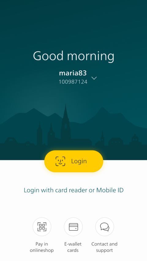
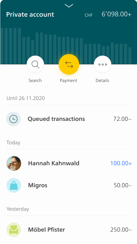
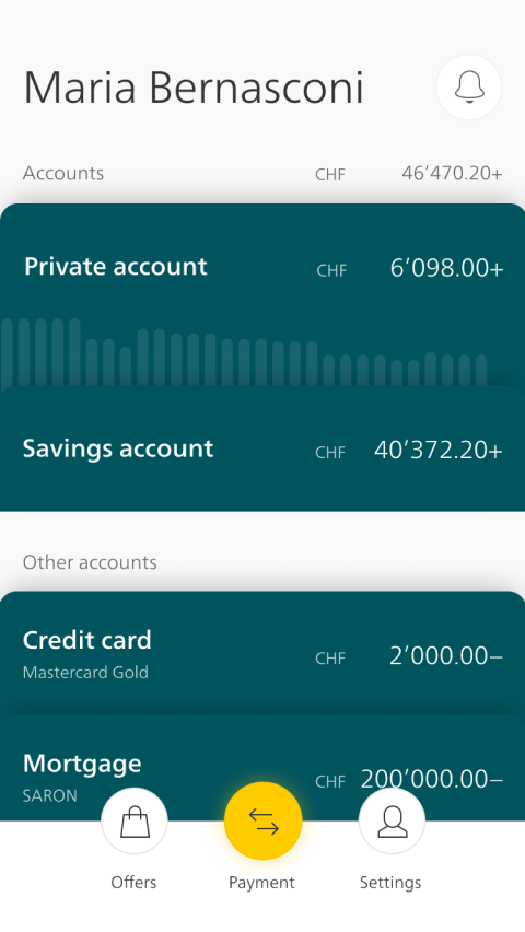
The user can easily log in via fingerprint or face recognition. The home screen is very reduced and shows only the most relevant features that are used on a daily basis: Balance of your bank account, payment and transfer functions, current transactions, and notifications.


50 shades of petrol for dark mode
PostFinance wanted the latest version of the app to have a young, fresh and innovative look. For the visual design concept, we, therefore, decided against the traditional brand color "yellow", and predominantly used "petrol". In this context, dark mode became an important issue, even more so with the introduction of IOS 13. Dark Mode ensures that texts are pleasant to read even in the dark. To make the app more individual and to improve readability we decided to go with different shades of dark petrol.


Guidance through motion
To make the app more intuitive we used animations. This part of the design is often perceived as "icing on the cake" but we introduced it from the very beginning as a way to guide people through the app and evoke feelings of safety and purpose.
"This is how banking is fun and we are proud of our fresh solution made for Switzerland."
CONCLUSION
A clear user focus wins
There are loads of banking apps on the market. Some people say they are all the same but we are convinced that details in design make the difference. The new PostFinance app puts the people using it on daily basis in the center. The simple and intuitive navigation and functions are tailored to their needs. As the management of personal finances increasingly happens on the go, the new app makes PostFinance stand out and stay recognizable in the jungle of app solutions. They offer their clients an easy way to not only stay on top of their finances but lay the foundation for realizing their dreams.


Project facts
Market
B2C
Industry
Finance & Banking
Type
Mobile Application
Services
Redesign
Duration
18 Sprints
Go Live
March 2021
Project team

Jessica
UX Design

Frank
Client Partner

Martin
UX Design

Nico
Motion Design

Mara
UX Research

Simon
Founder


