Kanton Zug
Find your way through bureaucracy
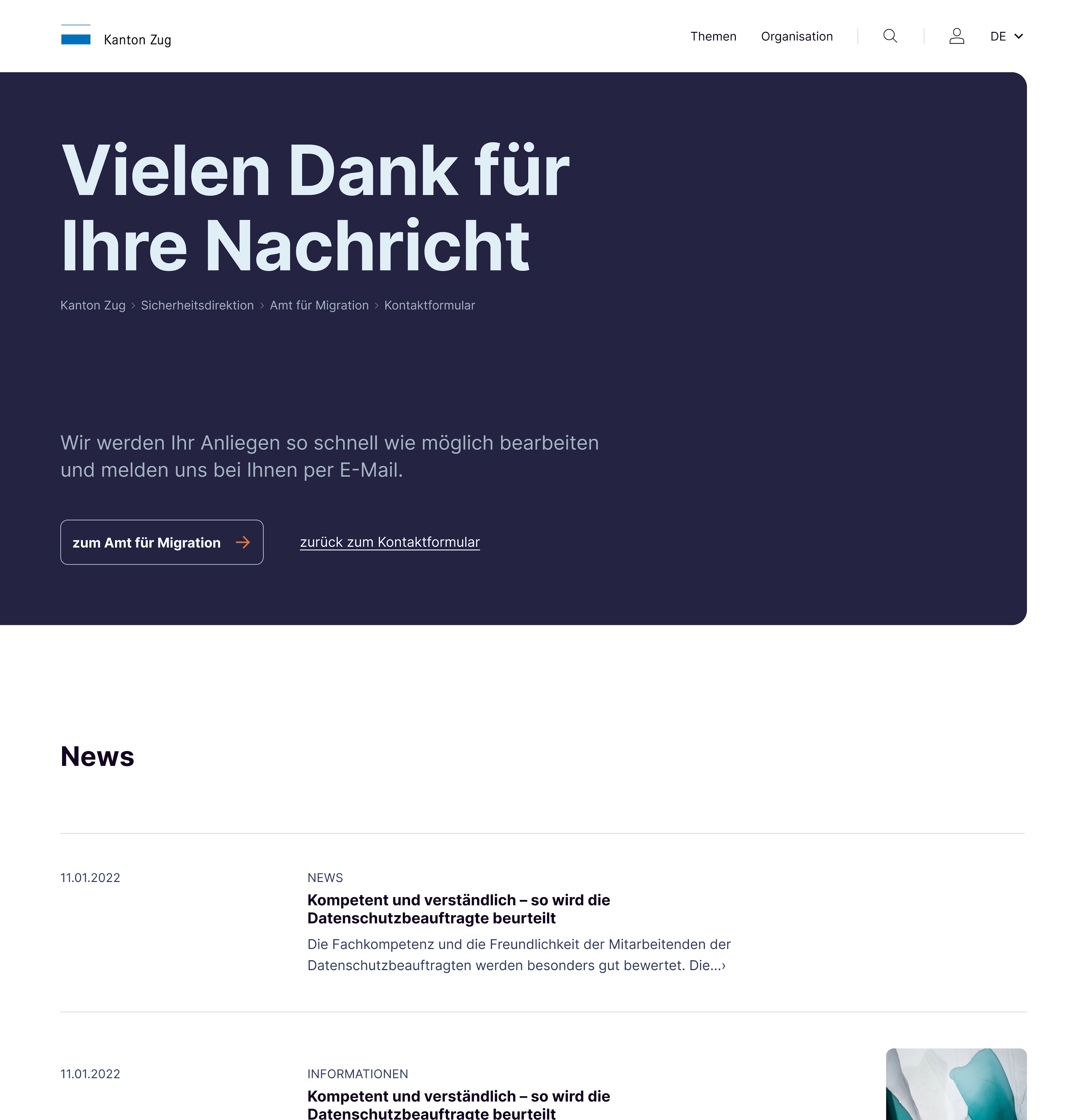
Do you know the famous scene in which Asterix and Obelix go through an aberration of bureaucracy in search of pass A38? The two Gauls are sent from office to office until they completely lose their bearings. We all have been through this before. An authority without any bureaucracy at all is not very realistic. However, many paths can be shortened. This was also the goal of the canton of Zug, which commissioned us with the redesign of its website.
1
.
6
k
sites were reworked content wise
7
.
5
k
components are in use

CHALLENGE
A needle in the haystack
The variety of topics, dossiers and forms presented a great challenge. In addition, many subtopics could not be clearly assigned to an overall topic. There was no uniform information structure for the various offices. This left many users in the dark when searching. They were not sure whether they had just clicked on the right link. The search behavior was not linear, but often a disoriented zigzag. Many visitors finally capitulated and reached for the phone to get personal advice from the office.
"In short: a FAQ for the citizens. And an important building block for the future e-government at the canton of Zug."
SOLUTION
Made for humans
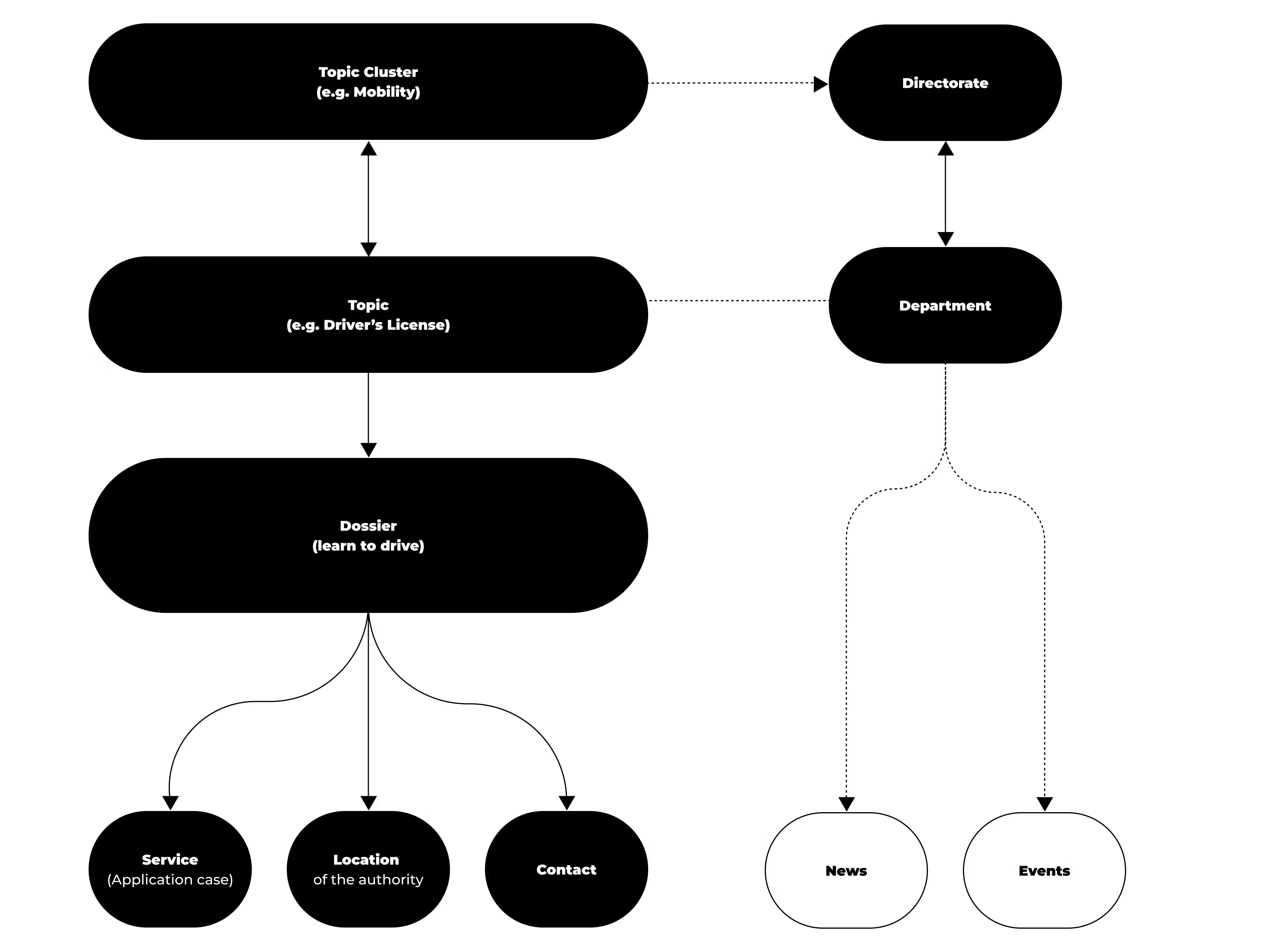
The way most people think is totally different from the way legal entities are organized. Neither of which we can change. However, we can create a site that accommodates for how people think. First, we divided all the information on the site into two parts: Topics, which are things that residents are concerned about, and Organization, which is mainly information used by authorities or professionals. In the second step, we optimized all elements of the site to create a pleasant search experience.
Find before searching
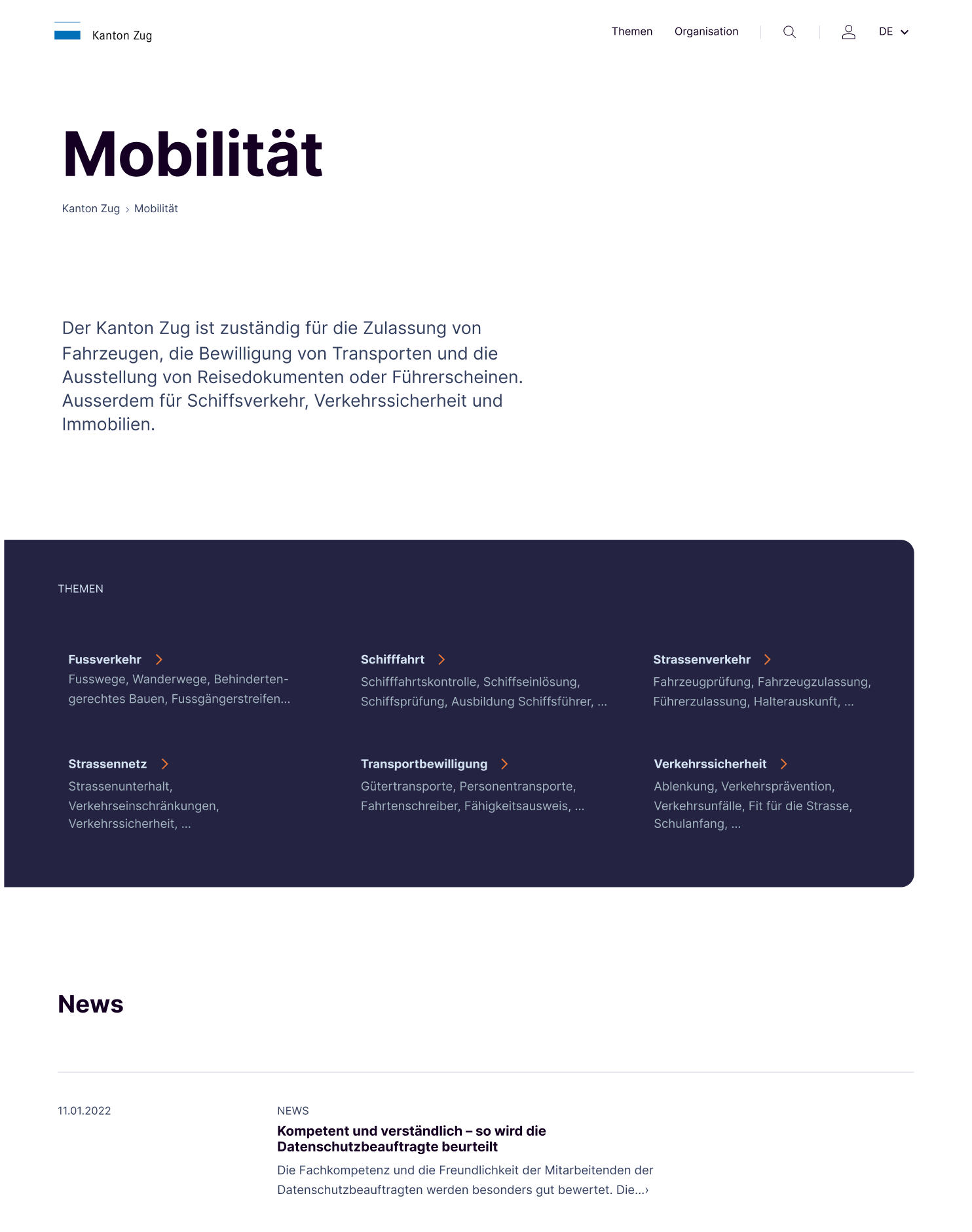
When you know exactly where to look, then searching is an easy task. Our new information architecture, validated through multiple iterative user tests, makes this possible. We created a topic module that on a top level already shows users where to find what they are looking for. Right from the start the user searches in a targeted, linear way. And, at the end, is rewarded with a sense of achievement by reaching a goal independently.

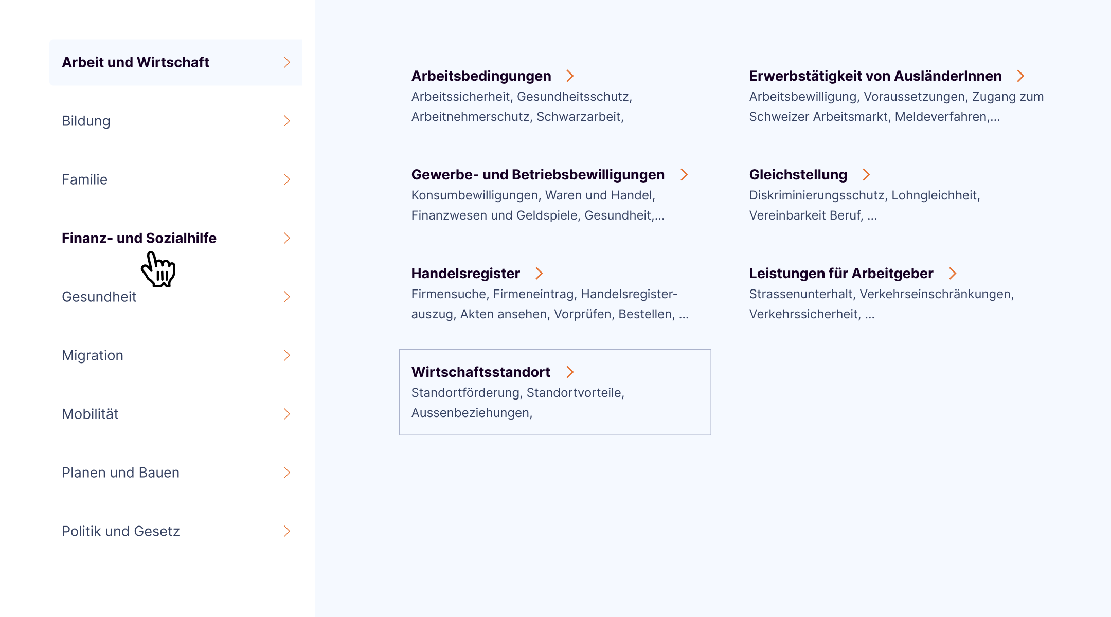
Navigation with overview
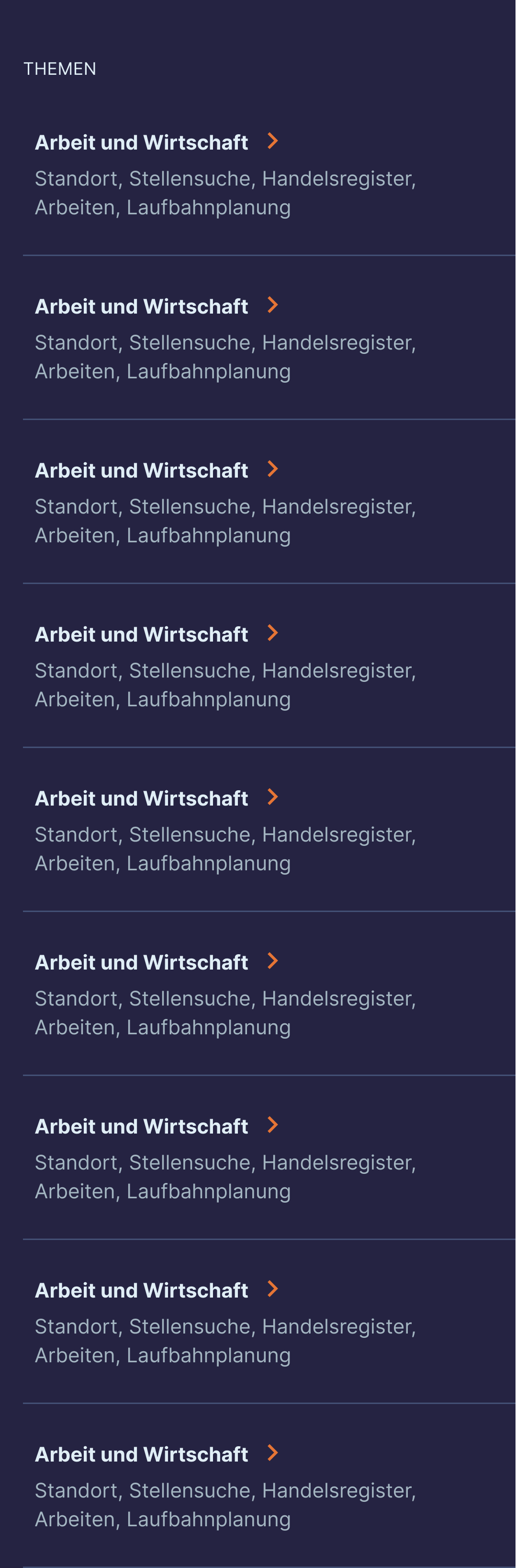
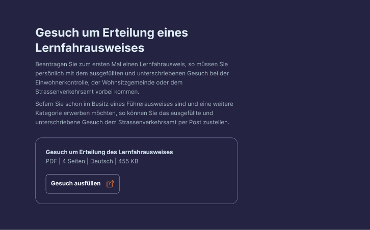
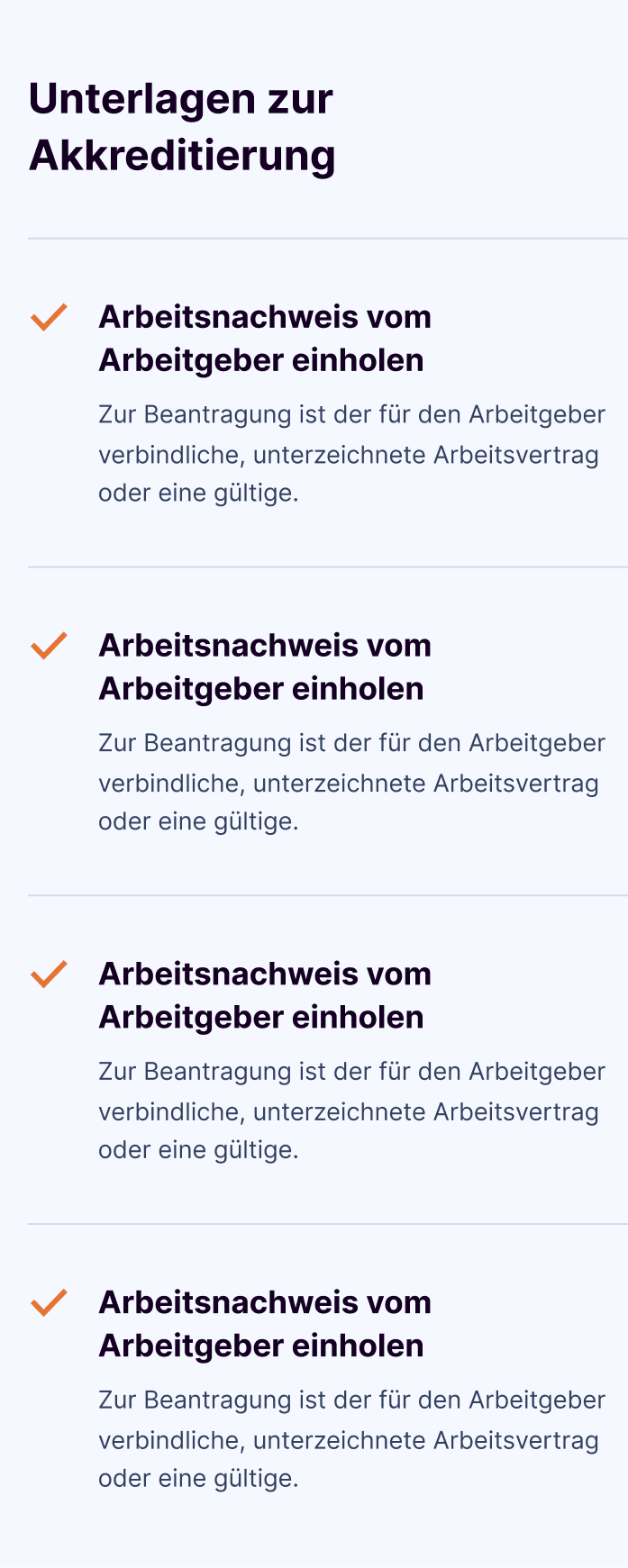
On a page that is home to so much information, every opportunity of a navigational aid should be used. Once the user visits a topic page, he gets a summary about the topic. The page navigation simultaneously works as a content overview of the current page and turns sticky when scrolling. This way, the user keeps track of each and every step of the search.
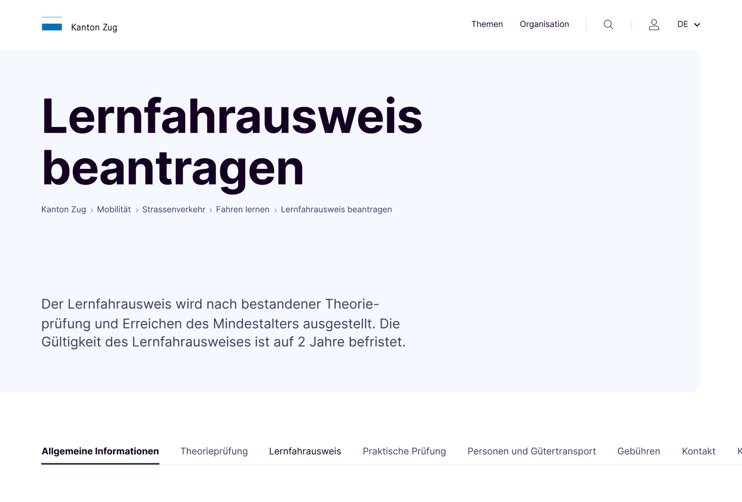
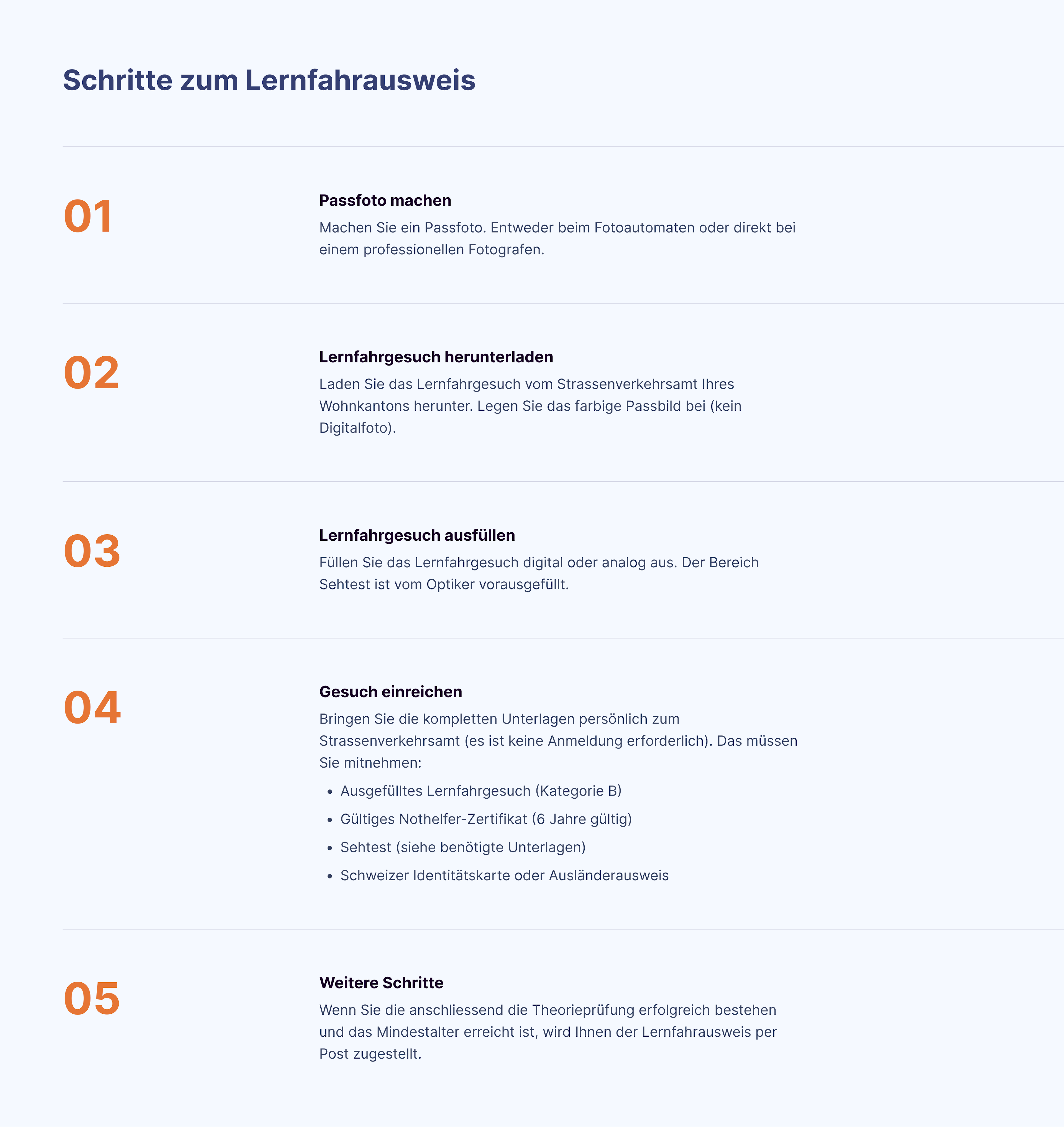
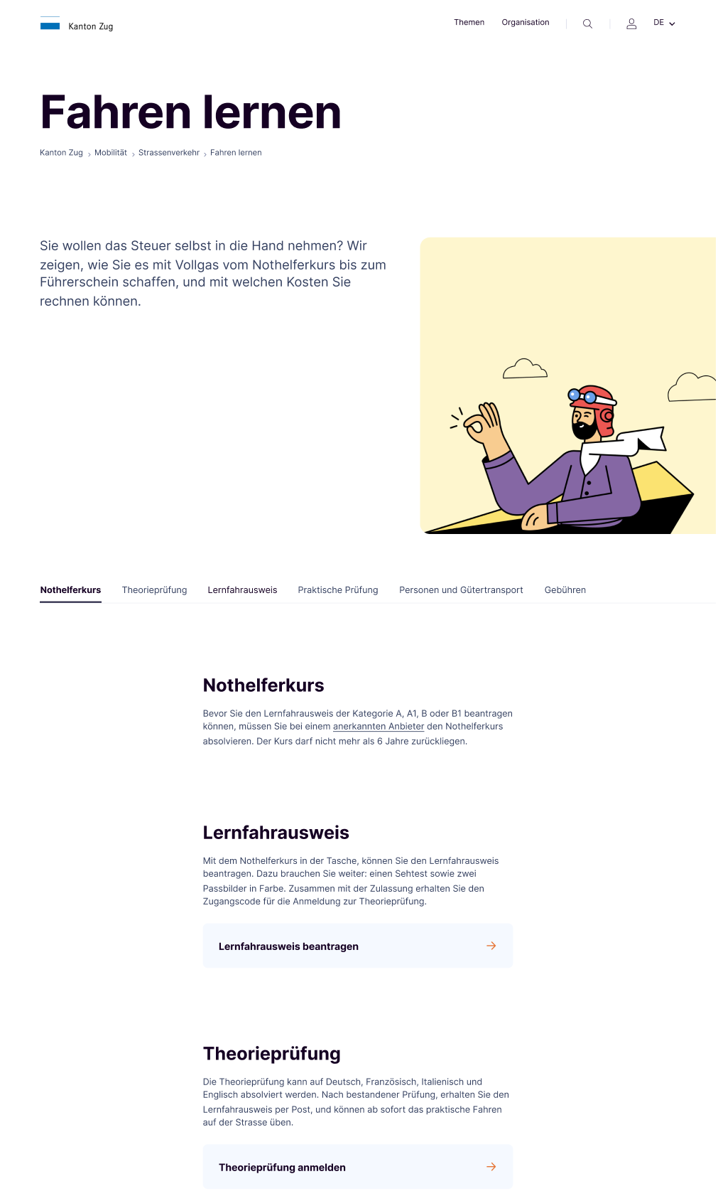
Some rest for your eyes
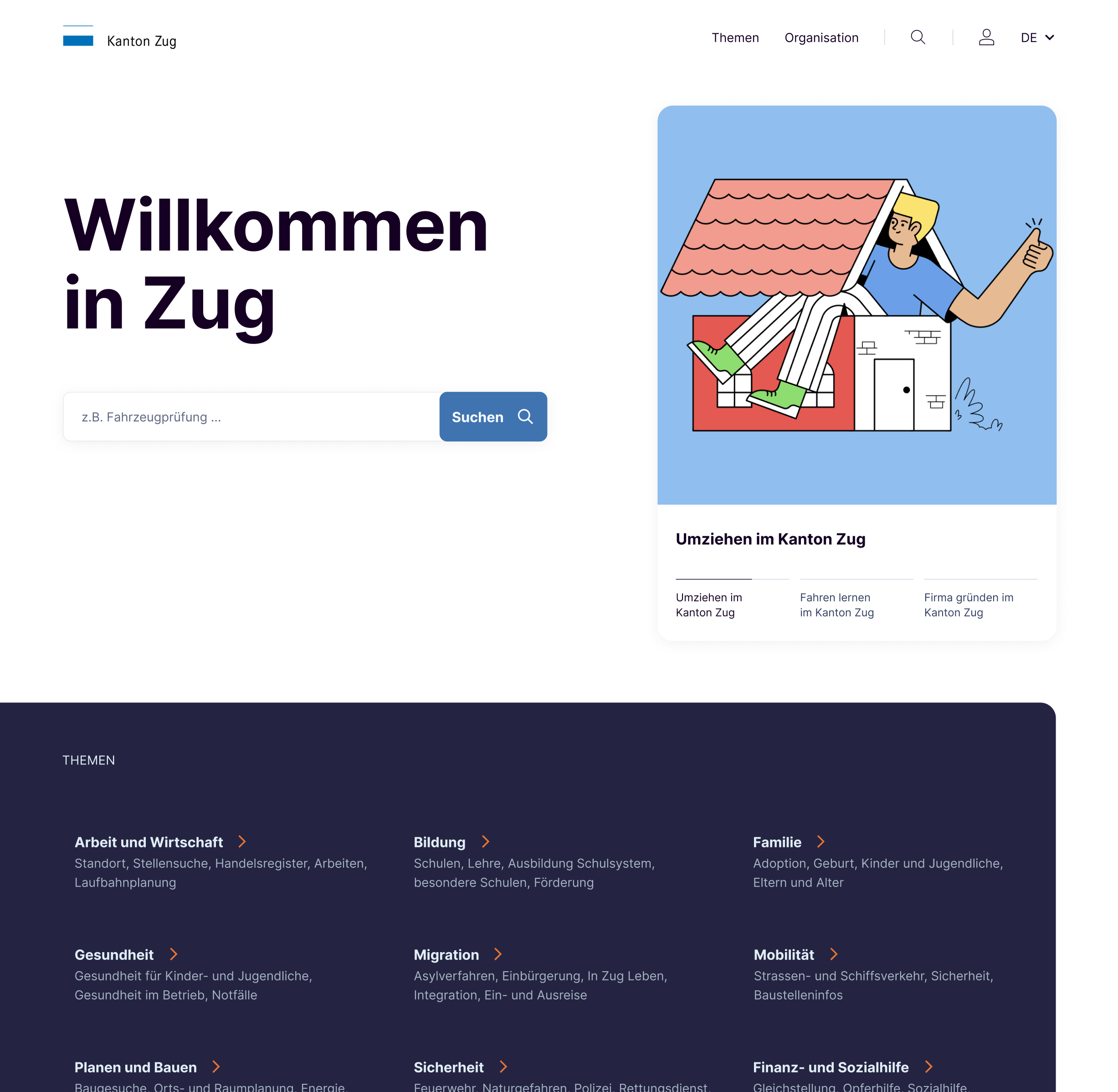
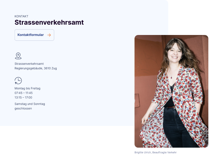
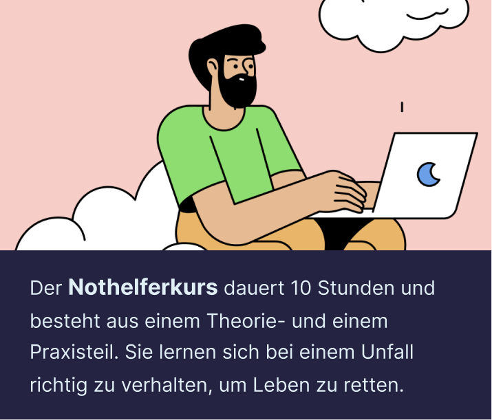
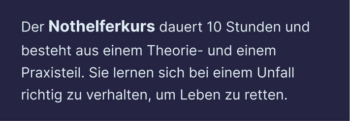
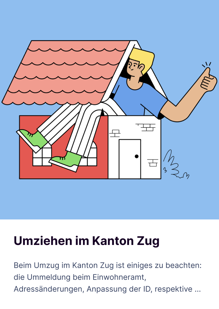
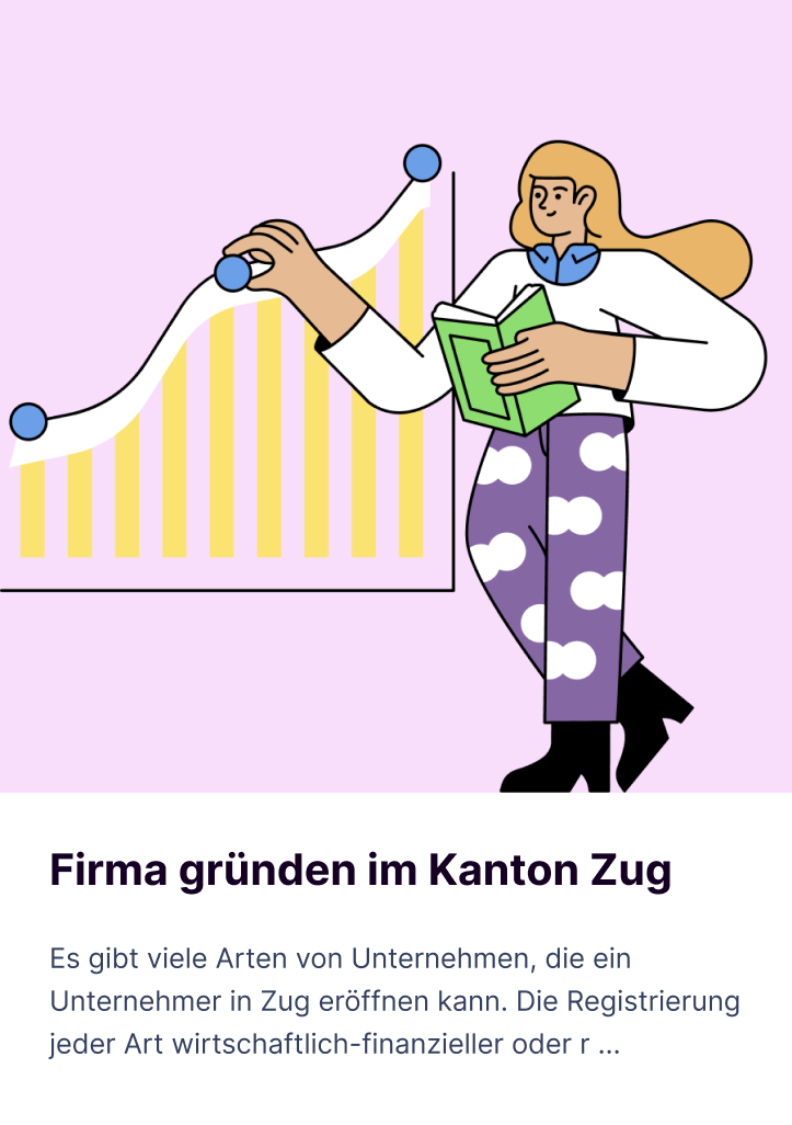
The site is primarily intended as an informative, functional source of information. That's why, it's good to break up the many blocks of text wherever useful. Illustrations signal users that they now arrived at a specific content page. In addition, we bring some color to the page and give users a short reading break in between.





CONCLUSION
With one foot in the future
On the redesigned website, residents of Zug are able to find answers to their problem in about four clicks. This has greatly reduced search times but also the number of calls for authorities. Furthermore, we designed the site to be able to flex to future requirements. New solutions can be seamlessly integrated: the implementation of digital forms will reduce the bureaucratic effort for the people in Zug even more. Resulting in an important strategic step towards a user-friendly citizen experience and further developments in e-government and the canton of Zug.
Project facts
Market
G2C
Industry
Government
Type
Website
Services
Content Audit · Usability Audit · User Tests · Concept & Design System
Duration
4 months
Go Live
May 2023
Project team

Anna
Client Partner

Sylvain
PM & UX Research

Kim
UI Design

Karl
UX Design

Nico
UI Design
