Zürcher Kantonalbank
The future of mobile banking
These days, many prefer to pay their bills via smartphone rather than at the counter. Neobanks have long since embraced this trend, offering an increasingly wide range of financial services in an "all-digital", and often mobile-first, environment. In contrast, many traditional banks are struggling to keep pace with the rapidly changing needs of their customers. ZKB, the Swiss Cantonal Bank of Zurich, is an exception, however…
Together with us, ZKB has not only revamped its mobile banking app and successfully launched the new version 2.0, but has already set new standards for building an entire user-centered mobile space of the future.


Challenge
Thinking about tomorrow
Neo-banks like Revolut are disrupting the market with ever more user-friendly and innovative apps. In contrast, ZKB's mobile banking app seemed like a relic from times long past. Although the app received good reviews, ZKB itself admitted that many processes were too complicated and the design was outdated. It was time to bring ZKB into the digital present and think about tomorrow when developing the new app of today.
"With passion, courage, fun, and an incredible team spirit, we started the new mobile era of ZKB."
Solution
Fast, simple, beautiful
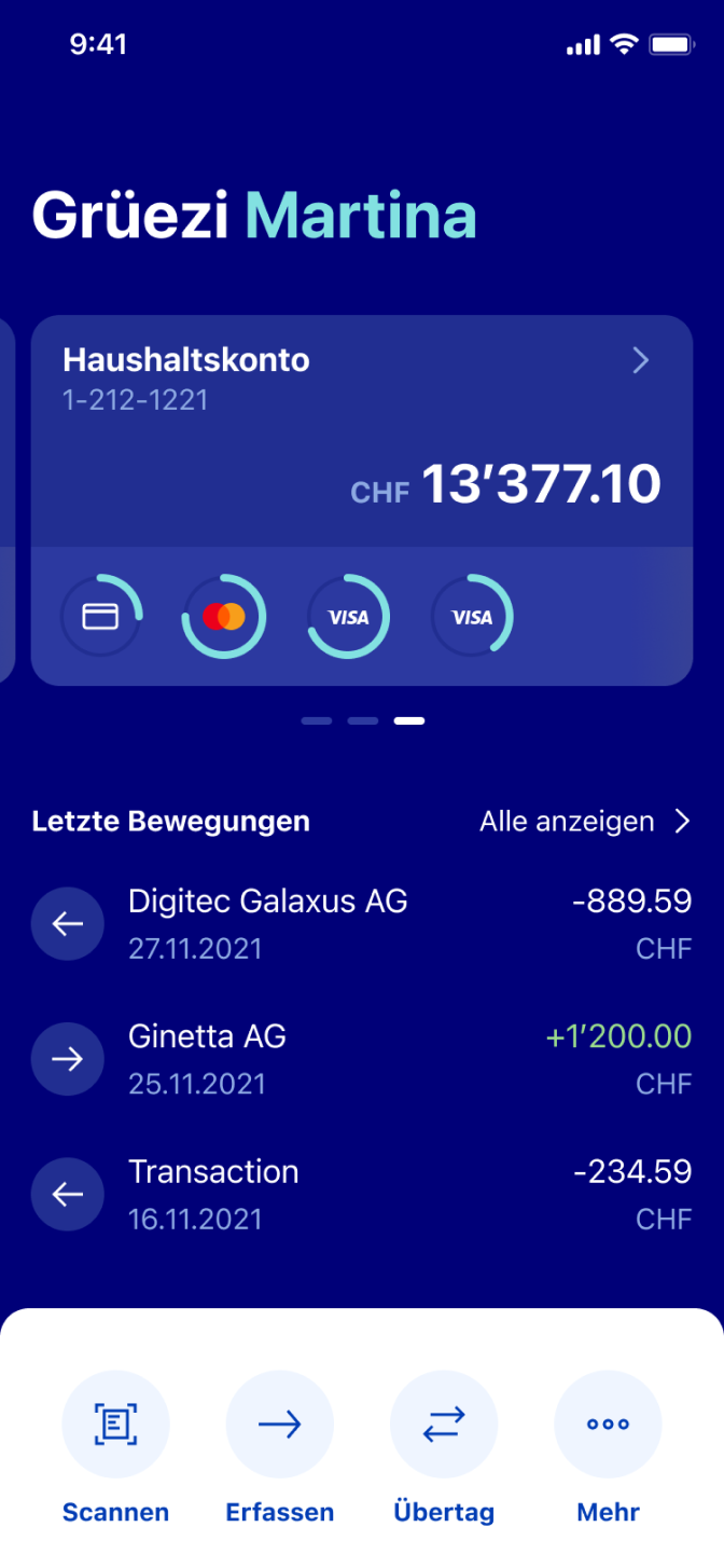
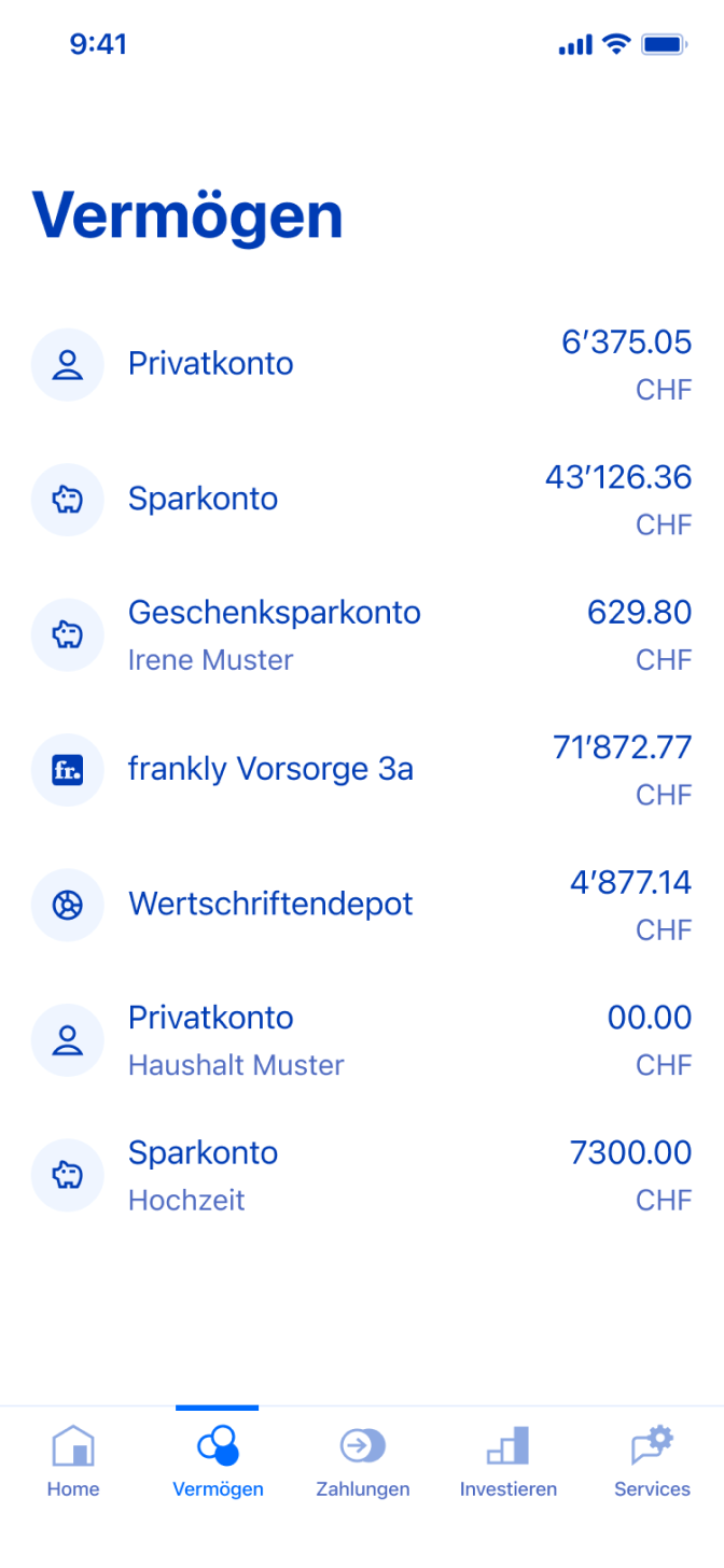
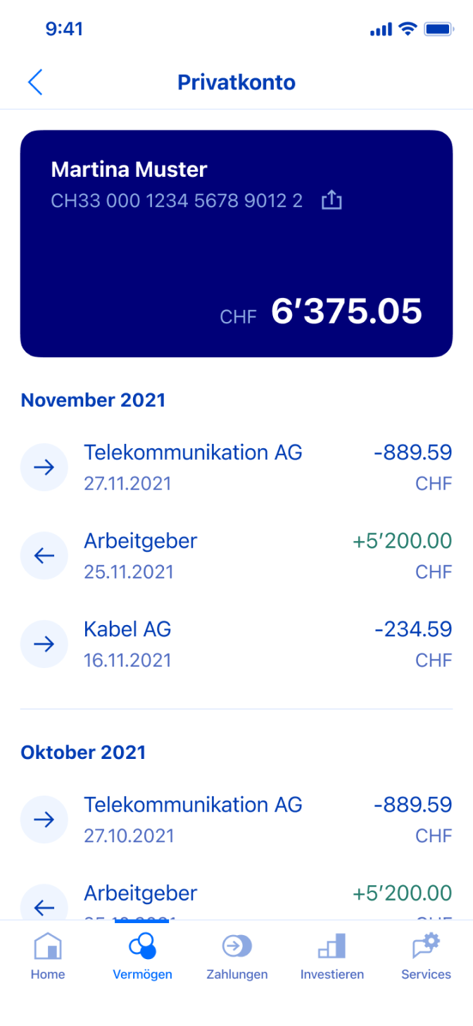
There are thousands of things to consider when redesigning an app. Especially when it's a well-loved app from a well-known brand like ZKB with almost a quarter-million users. We, therefore, approached major design decisions – like rethinking the navigation – with great care and with established user habits in mind. The result is a fast and easy-to-use app with a fresh look, in line with the latest brand guidelines, based on a design system with reusable elements that will enable consistent and user-centric development of all future ZKB mobile apps.


Home screen with shortcuts
The home screen, as the most relevant starting point for the user, needs careful thought. Why is the user even opening the app? What does the user want to see or do first? The answers to these questions have led us to create a screen that combines both static shortcuts for direct access to the most used functions and dynamic content with the most important information, such as the current account balance. In addition, the new bottom navigation ensures that all other functions are just a tap away from anywhere in the app. Bye-bye overloaded burger nav.


Found quickly. Done quickly
Have you ever walked into a kitchen for the first time and still intuitively known where to find what? That's pretty much how it feels for (new) users of the ZKB App 2.0. We created, tested, and simplified the new information architecture entirely according to their needs, preferences, and habits. As a result, we not only said goodbye to the multi-layered, complex burger navigation and switched to the new bottom navigation but also broke down all tasks into small, manageable chunks to make functions simpler and easier to understand.

More than meets the eye
And finally, let's talk about the look. When it comes to visual design, there’s a lot more to it than meets the eye. Take for example the subtle color variations we added to ensure optimal contrast and effortless theming between light and dark modes. The same goes for typography, where we've created a versatile typeface with a clear and purposeful hierarchy. When used wisely, color and typography alone can go a long way toward making a product more accessible and desirable to its users. But: consistency is key. This is where the new design system comes into play.


"A big part of developing the visual design of the app was fine-tuning the color palette to fit the brand while still adhering to the highest accessibility standards."
Conclusion
Big impact on a small screen
The redesign was the starting signal for ZKB to catch up with other (neo-)banks in the mobile sector. Together with ZKB, we were not only able to launch a mobile banking app 2.0 that exploits all the advantages of user-centered design, but also a design system that will serve as a tool in the future to establish, expand, and maintain the high-quality standard across apps. Thinking long-term and designing for tomorrow today is one of the most important aspects of our work and one of the main reasons why customers want to work with us.
Project facts
Market
B2C
Industry
Finance & Banking
Type
Mobile Application
Services
Design
Duration
Sep 2020 – May 2022
Go Live
February 2022
Project team

Joel
Design
Corina
UX Design

Selina
UX Research

Nico
UX Design

Giacomo
UX Design

Juan-Pablo
UX Design

Martin
UX Design
